
IELTS Academic Writing Task 1Samples by band
Band 8 & 9 sample answers
Task 1 Academic answers that scored Band 8 or higher, each with criterion scores and full feedback.
Mixed charts
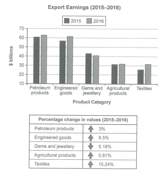
Export Earnings by Category in 2015 and 2016
The chart below shows the value of one country’s exports in various categories during 2015 and 2016. The table shows the percentage change in each category of exports in 2016 compared with 2015. Summarise the information by selecting and reporting the main features, and make comparisons where relevant.
Process
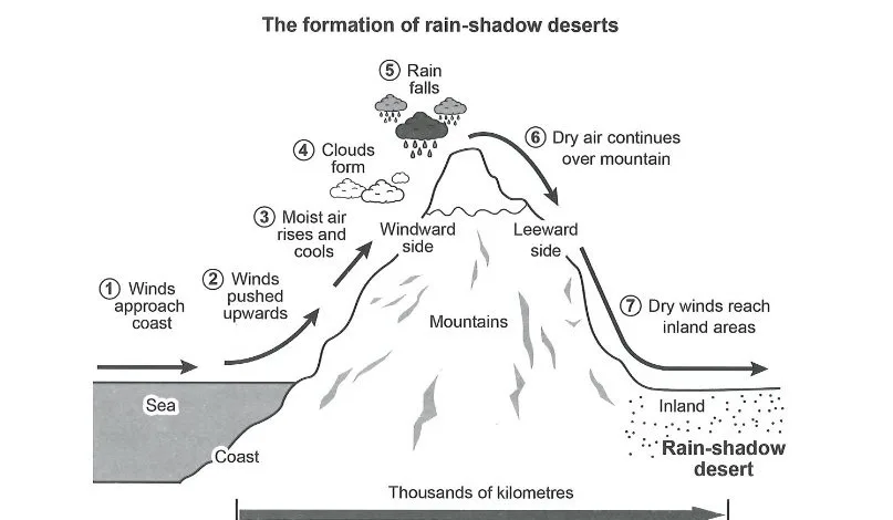
Formation of a Rain-Shadow Desert Diagram
The diagram below shows how one type of desert, known as a rain-shadow desert, is formed. Summarise the information by selecting and reporting the main features, and make comparisons where relevant.
Process
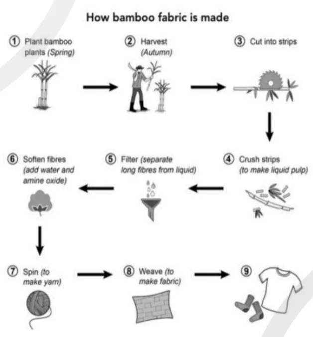
Bamboo Fabric Manufacturing Process
The diagram below shows how fabric is manufactured from bamboo. Summarise the information by selecting and reporting the main features, and make comparisons where relevant.
Mixed charts
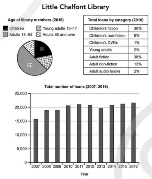
Little Chalfont Library Membership and Loans
The charts below give information about a public library in a town called Little Chalfont. Summarise the information by selecting and reporting the main features, and make comparisons where relevant.
Table
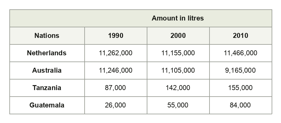
Milk Production in Four Countries
The table below shows the production of milk annually in four countries in 1990, 2000 and 2010. Summarise the information by selecting and reporting the main features, and make comparisons where relevant.
Process
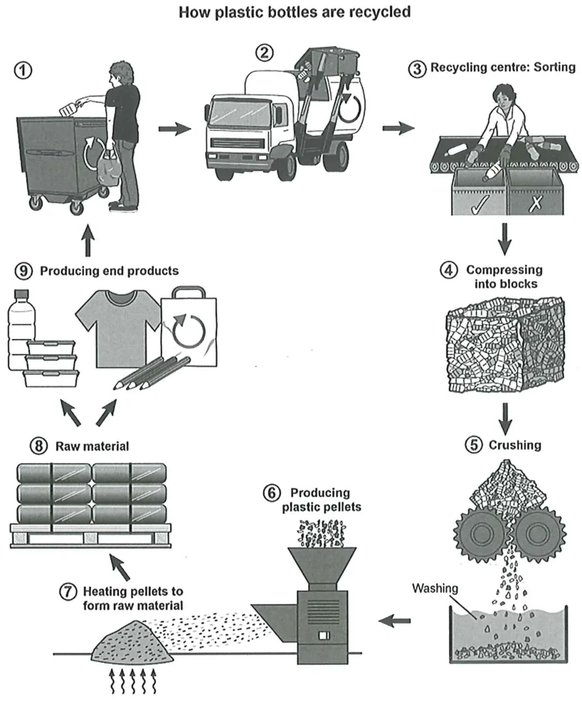
Plastic Bottle Recycling Process Diagram
The diagram below shows the process for recycling plastic bottles. Summarise the information by selecting and reporting the main features, and make comparisons where relevant.
Map
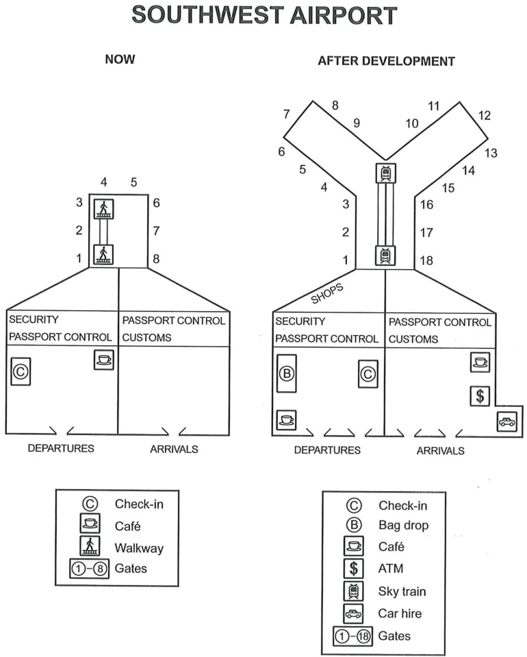
Southwest Airport Redevelopment Plans
The plans below show the site of an airport now and how it will look after redevelopment next year. Summarise the information by selecting and reporting the main features, and make comparisons where relevant.
Map
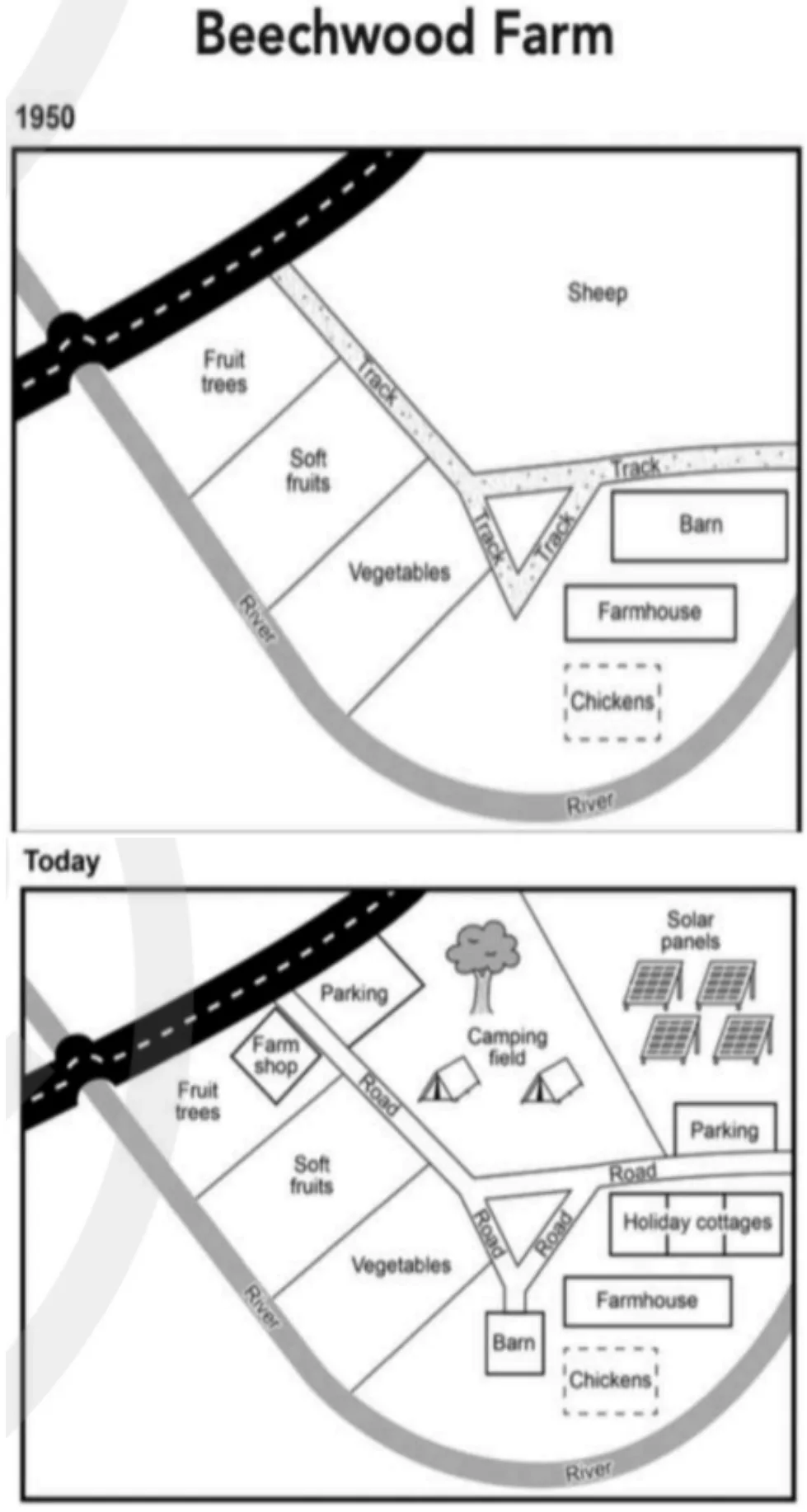
Beechwood Farm Site Changes from 1950 to Today
The plans below show the site of a farm in 1950 and the same site today. Summarise the information by selecting and reporting the main features, and make comparisons where relevant.
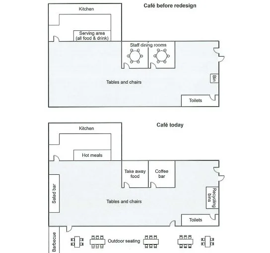
Map
College Café Redesign Plans Before and Now
The plans below show a college café before it was redesigned and how it looks now. Summarise the information by selecting and reporting the main features, and make comparisons where relevant.
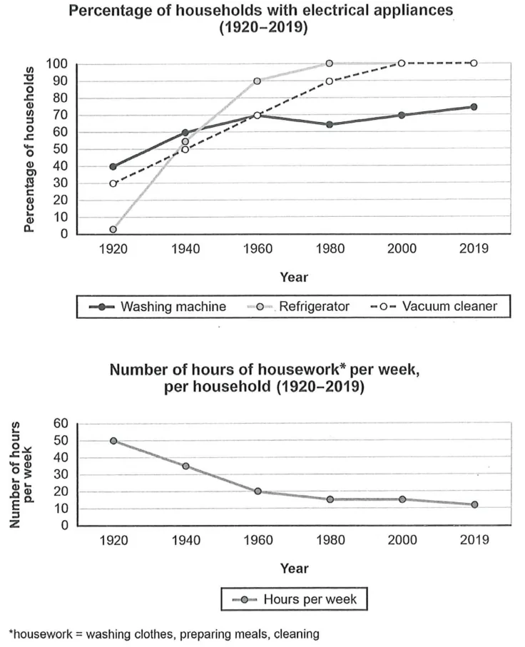
Line graph
Electrical Appliance Ownership and Housework Time
The charts below show the changes in ownership of electrical appliances and amount of time spent doing housework in households in one country between 1920 and 2019. Summarise the information by selecting and reporting the main features, and make comparisons where relevant.
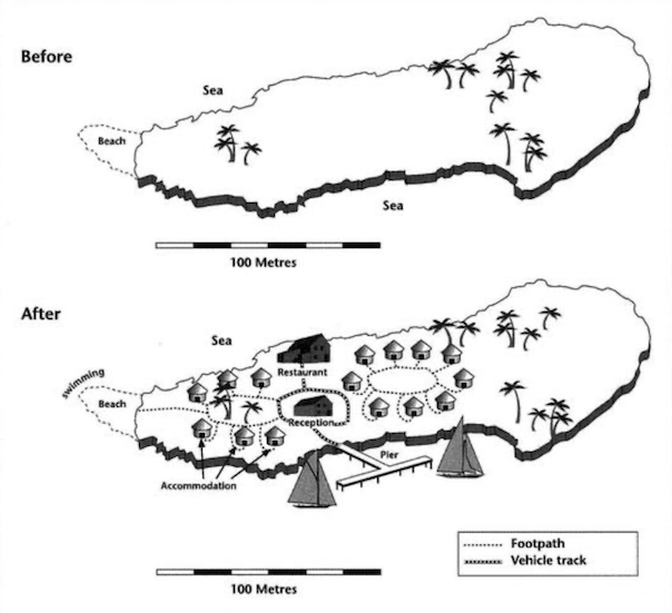
Map
Island Tourist Facilities Before and After Development Map
The two maps below show an island, before and after the construction of some tourist facilities. Summarise the information by selecting and reporting the main features and make comparisons where relevant.
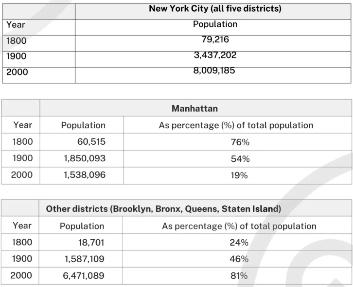
Table
New York City Population by District 1800-2000
The first table below shows changes in the total population of New York City from 1800 to 2000. The second and third tables show changes in the population of the five districts of the city (Manhattan, Brooklyn, Bronx, Queens, Staten Island) over the same period. Summarise the information by selecting and reporting the main features, and make comparisons where relevant.
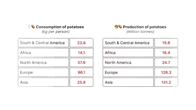
Table
Potato Consumption and Production by Region in 2006
The tables below provide information about the consumption and production of potatoes in five parts of the world in 2006.
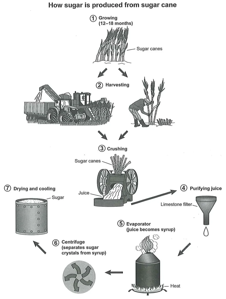
Process
Sugar Production Process from Sugar Cane
The diagram below shows the manufacturing process for making sugar from sugar cane. Summarise the information by selecting and reporting the main features, and make comparisons where relevant.
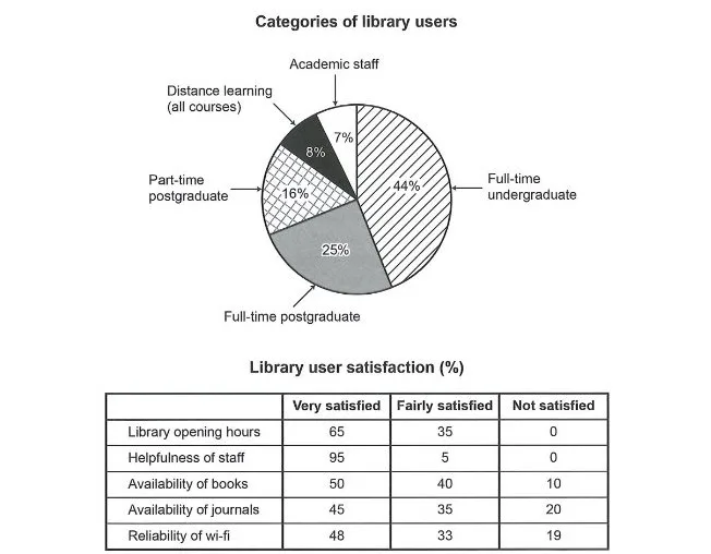
Mixed charts
University Library Users and Satisfaction Survey
The chart and table below show the results of a survey of library users at a university. Summarise the information by selecting and reporting the main features, and make comparisons where relevant.
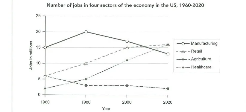
Line graph
US Jobs in Four Economic Sectors 1960-2020
The graph below gives information about the number of jobs in four sectors of the economy in the US between 1960 and 2020. Summarise the information by selecting and reporting the main features, and make comparisons where relevant.
Mixed charts
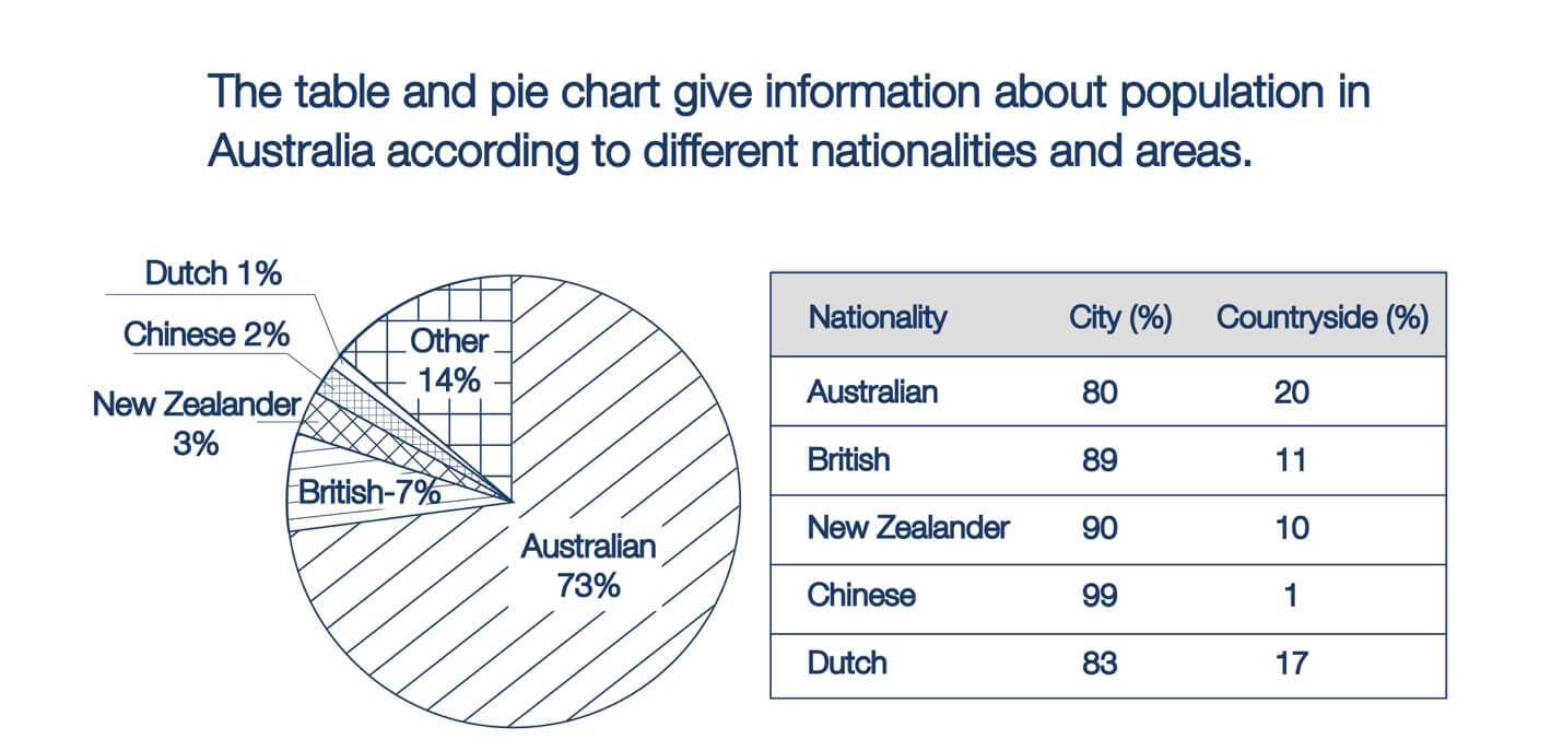
Australia Population by Nationality and Area
The table and pie chart give information about the population in Australia according to different nationalities and areas.
Process
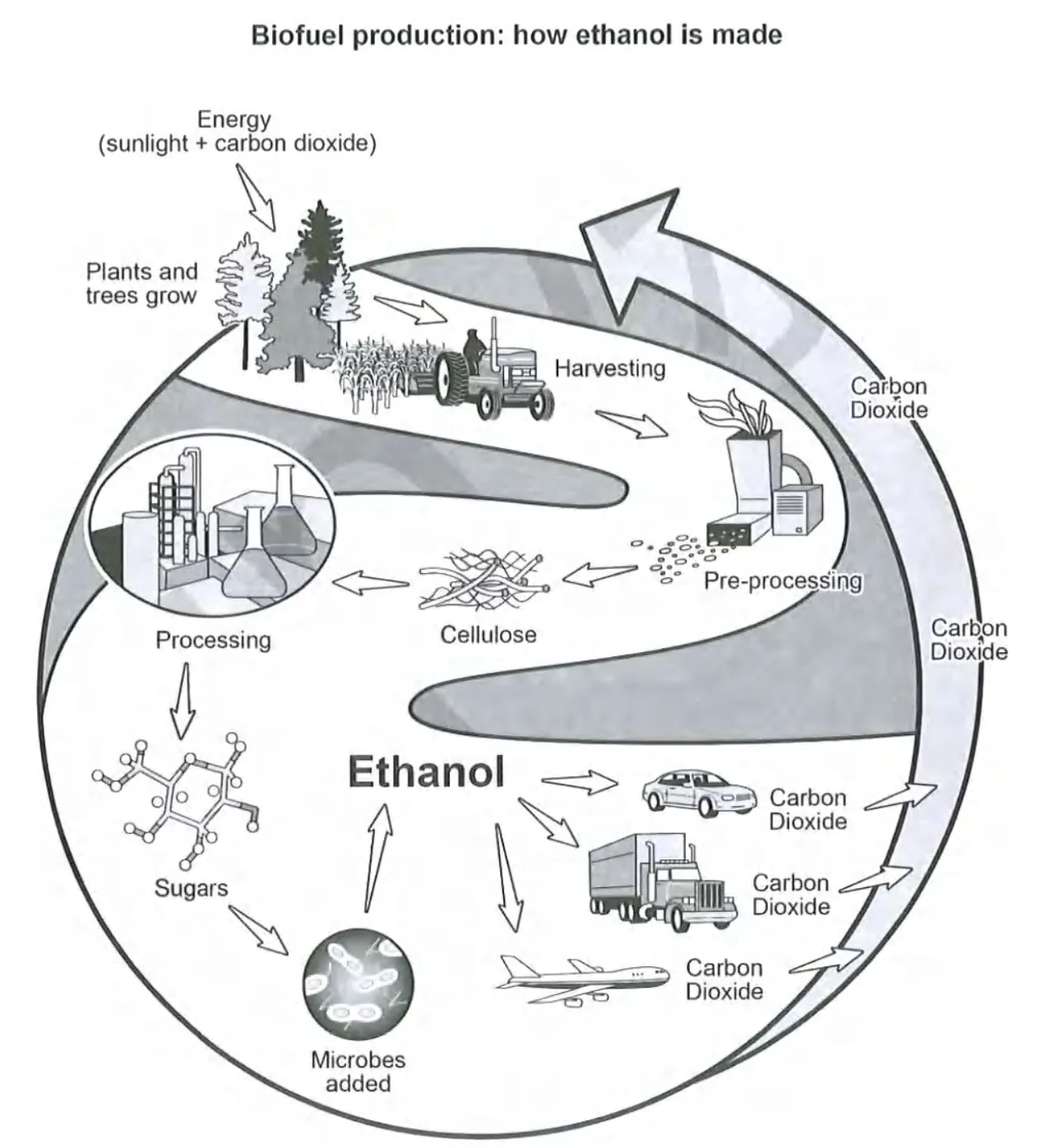
Ethanol Biofuel Production Process
The diagram below shows how a biofuel called ethanol is produced. Summarise the information by selecting and reporting the main features, and make comparisons where relevant.
Bar chart
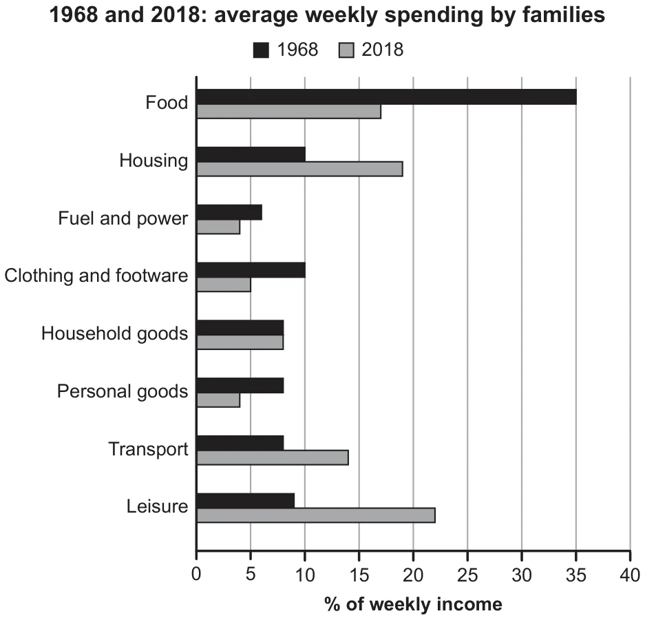
Family Weekly Spending in 1968 and 2018
The chart below gives information about how families in one country spent their weekly income in 1968 and in 2018. Summarise the information by selecting and reporting the main features, and make comparisons where relevant.
Mixed charts
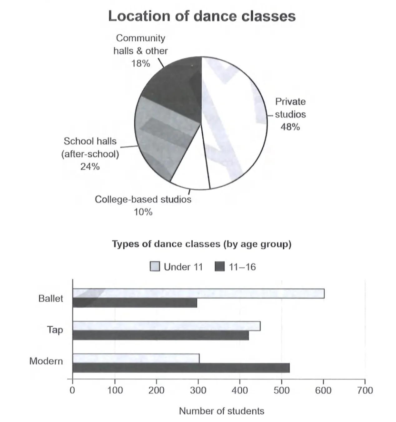
Location and Types of Dance Classes in Australia
The charts below give information on the location and types of dance classes young people in a town in Australia are currently attending. Summarise the information by selecting and reporting the main features, and make comparisons where relevant.
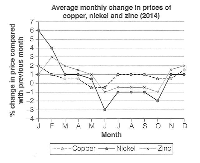
Line graph
Monthly Price Changes of Three Metals in 2014
The graph below shows the average monthly change in the prices of three metals during 2014. Summarise the information by selecting and reporting the main features, and make comparisons where relevant.
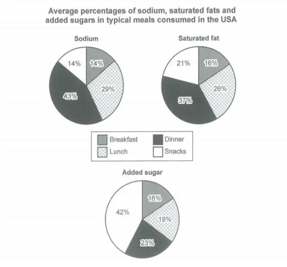
Pie chart
Nutrients in Typical US Meals Pie Charts
The charts below show the average percentages in typical meals of three types of nutrients, all of which may be unhealthy if eaten too much. Summarise the information by selecting and reporting the main features, and make comparisons where relevant.
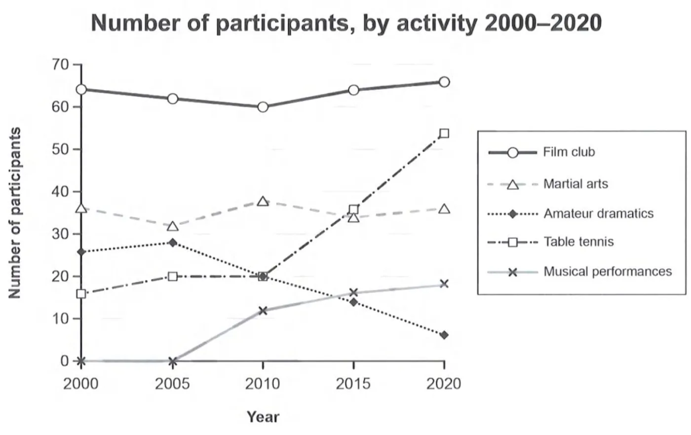
Line graph
Participants in Melbourne Social Centre Activities (2000–2020)
The graph below gives information on the numbers of participants for different activities at one social centre in Melbourne, Australia for the period 2000 to 2020. Summarise the information by selecting and reporting the main features, and make comparisons where relevant.
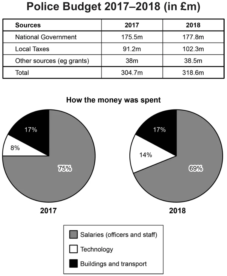
Mixed charts
Police Budget Sources and Spending in Britain
The table and charts below give information on the police budget for 2017 and 2018 in one area of Britain. The table shows where the money came from and the charts show how it was distributed. Summarise the information by selecting and reporting the main features, and make comparisons where relevant.
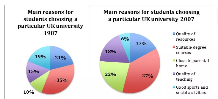
Pie chart
Reasons Students Chose a UK University (1987-2007)
The pie charts below show the main reasons why students chose to study at a particular UK university in 1987 and 2007. Summarise the information by selecting and reporting the main features, and make comparisons where relevant.
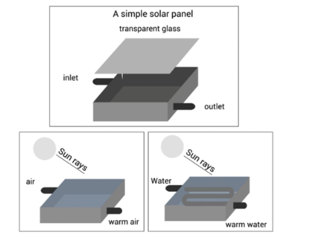
Process
Solar Panel Structure and Use Diagram
The diagrams below show the structure of a solar panel and how it is used. Summarise the information by selecting and reporting the main features, and make comparisons where relevant.
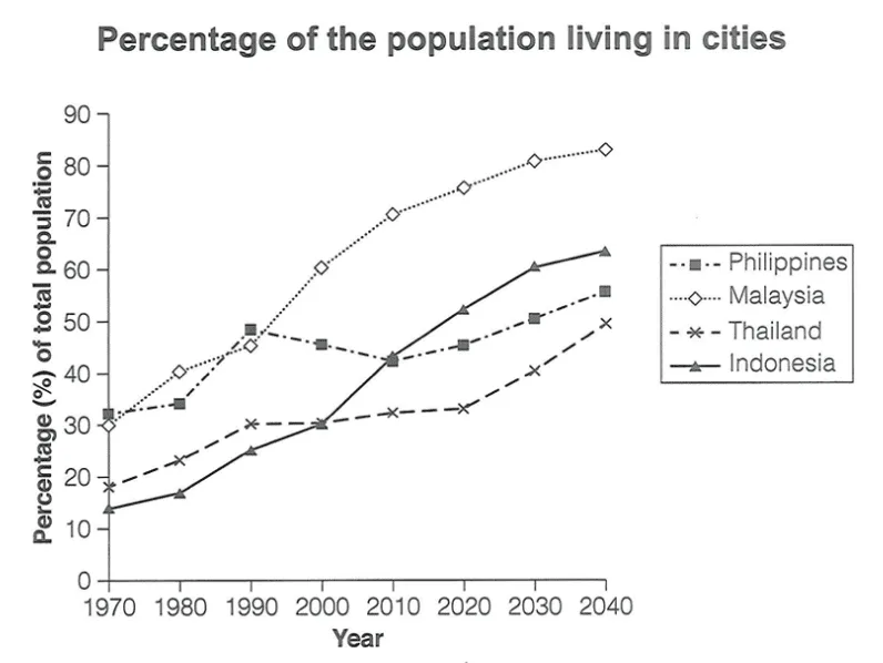
Line graph
Urban Population Percentage in Four Asian Countries 1970-2040
The graph below gives information about the percentage of the population in four Asian countries living in cities from 1970 to 2020, with predictions for 2030 and 2040. Summarise the information by selecting and reporting the main features, and make comparisons where relevant.
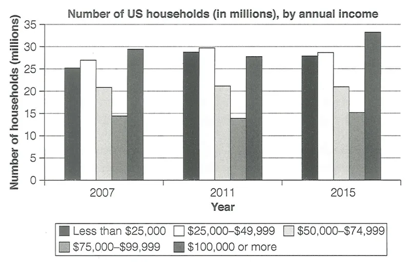
Bar chart
US Households by Annual Income
The chart below shows the number of households in the US by their annual income in 2007, 2011 and 2015. Summarise the information by selecting and reporting the main features, and make comparisons where relevant.
Official Cambridge answers at Band 7.5+
Examiner-scored candidate answers from Cambridge IELTS.
Cambridge IELTS 17 · Academic · Test 2 · Writing Task 1
Police Budget Sources and Spending in Britain
The table and charts below give information on the police budget for 2017 and 2018 in one area of Britain. The table shows where the money came from and the charts show how it was distributed. Summarise the information by selecting and reporting the main features, and make comparisons where relevant.
Cambridge IELTS 17 · Academic · Test 4 · Writing Task 1
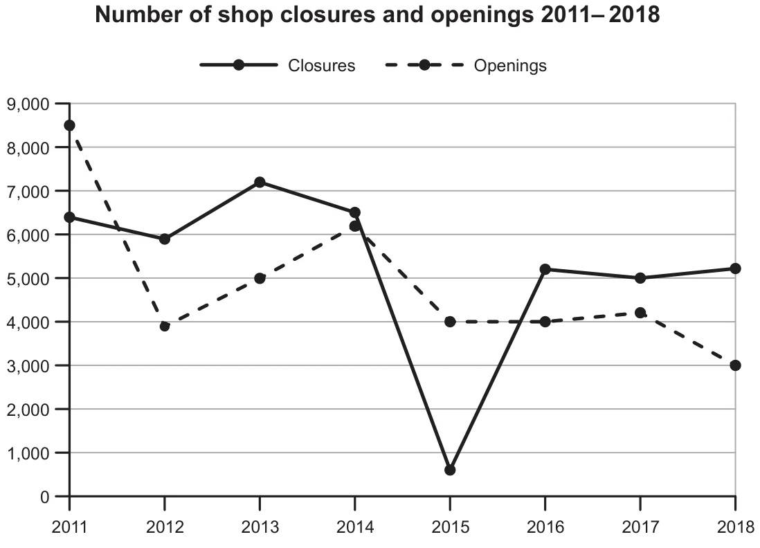
Shop Closures and Openings 2011-2018
The graph below shows the number of shops that closed and the number of new shops that opened in one country between 2011 and 2018. Summarise the information by selecting and reporting the main features, and make comparisons where relevant.