
IELTS Academic Writing Task 1Question type
Mixed charts
Connect the main patterns across two visual sources.
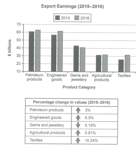
Export Earnings by Category in 2015 and 2016
The chart below shows the value of one country’s exports in various categories during 2015 and 2016. The table shows the percentage change in each category of exports in 2016 compared with 2015. Summarise the information by selecting and reporting the main features, and make comparisons where relevant.
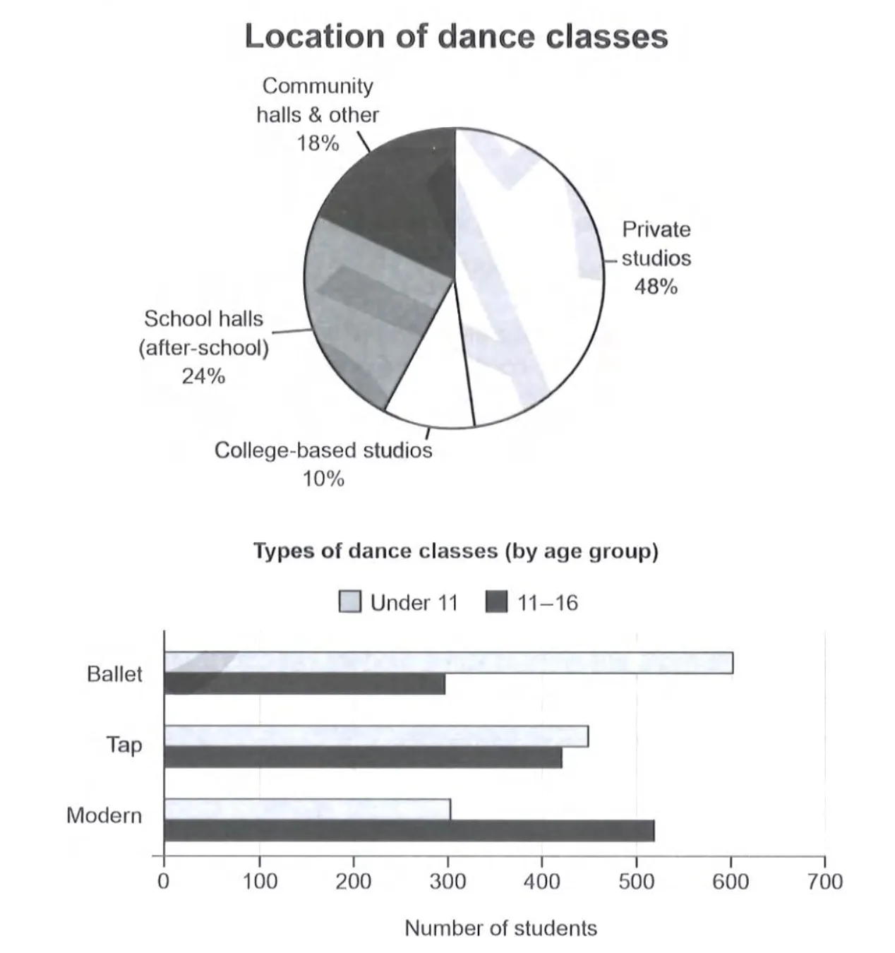
Location and Types of Dance Classes in Australia
The charts below give information on the location and types of dance classes young people in a town in Australia are currently attending. Summarise the information by selecting and reporting the main features, and make comparisons where relevant.
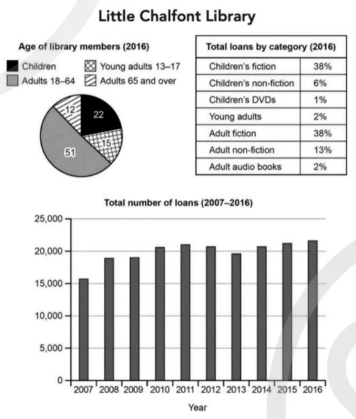
Little Chalfont Library Membership and Loans
The charts below give information about a public library in a town called Little Chalfont. Summarise the information by selecting and reporting the main features, and make comparisons where relevant.
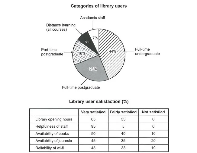
University Library Users and Satisfaction Survey
The chart and table below show the results of a survey of library users at a university. Summarise the information by selecting and reporting the main features, and make comparisons where relevant.
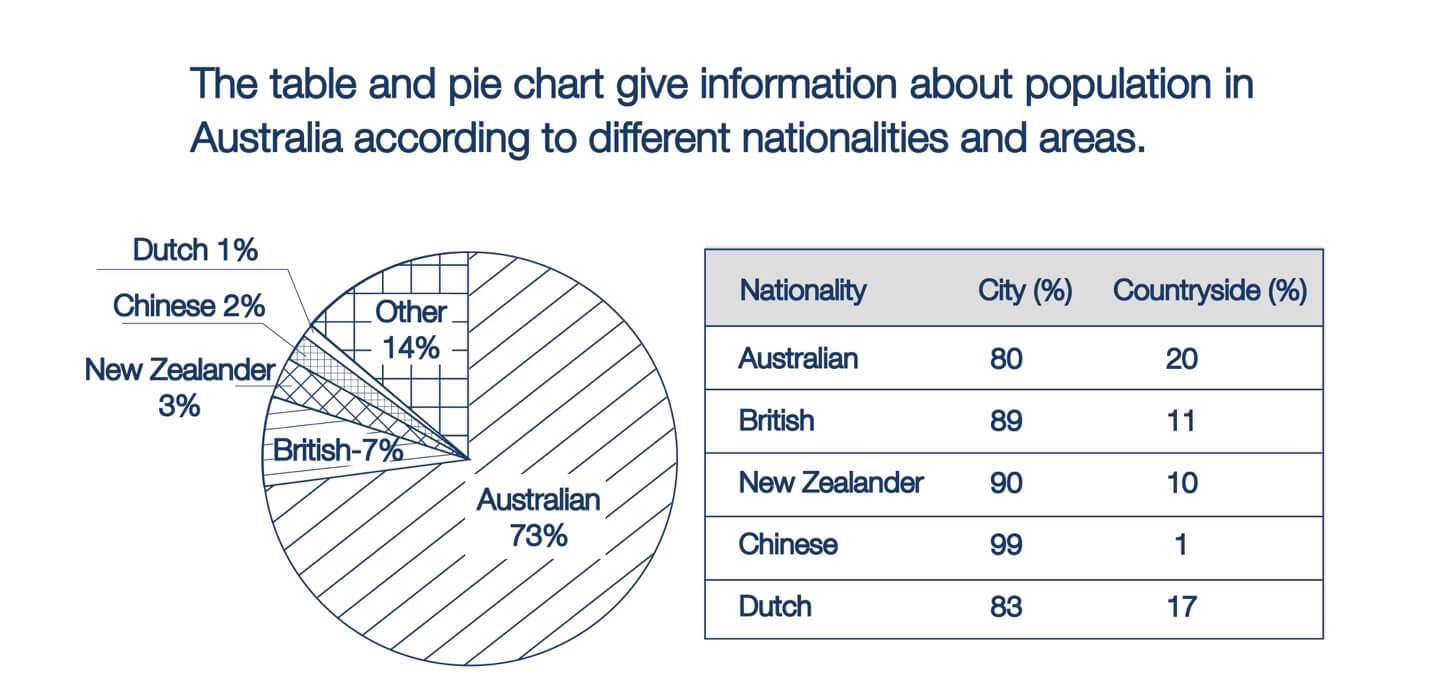
Australia Population by Nationality and Area
The table and pie chart give information about the population in Australia according to different nationalities and areas.
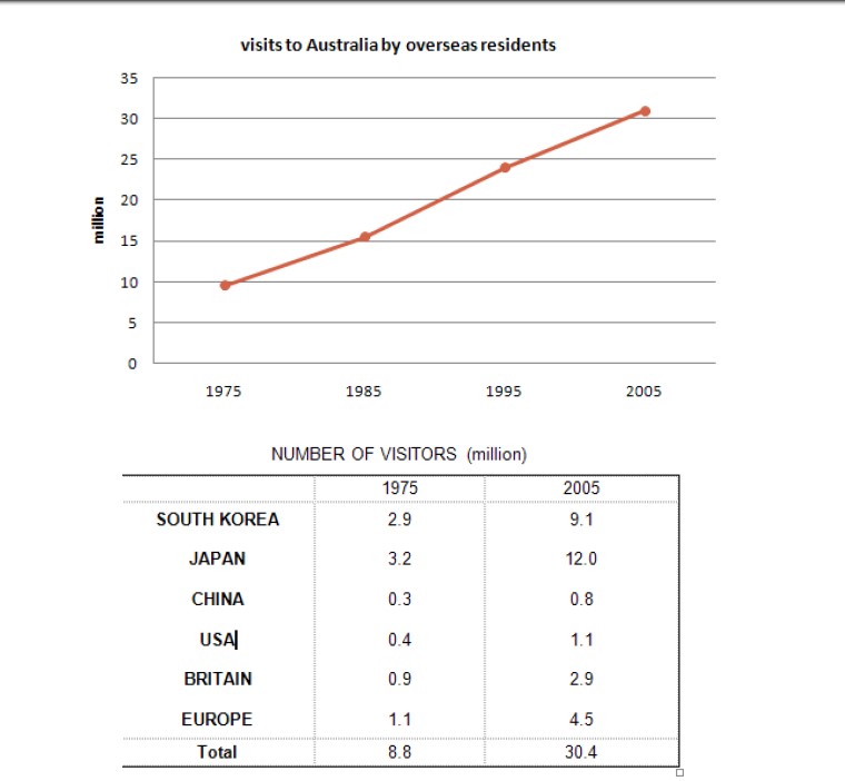
Annual Overseas Visitors to Australia
The line graph below shows the number of annual visits to Australia by overseas residents. The table below gives information on the country of origin where the visitors came from. NUMBER OF VISITORS (million) 1975 | 2005 SOUTH KOREA JAPAN CHINA USA BRITAIN EUROPE | 2.9 3.2 0.3 0.4 0.9 1.1 | 9.1 12.0 0.8 1.1 2.9 4.5 Total | 8.8 | 30.4
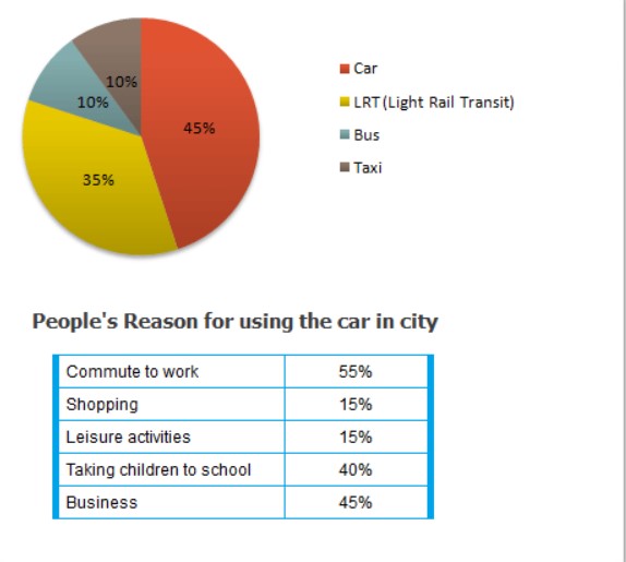
Transport and Car Use in Edmonton
The diagrams below give information on transport and car use in Edmonton.
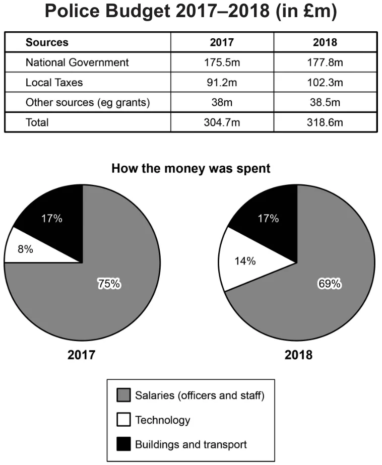
Police Budget Sources and Spending in Britain
The table and charts below give information on the police budget for 2017 and 2018 in one area of Britain. The table shows where the money came from and the charts show how it was distributed. Summarise the information by selecting and reporting the main features, and make comparisons where relevant.