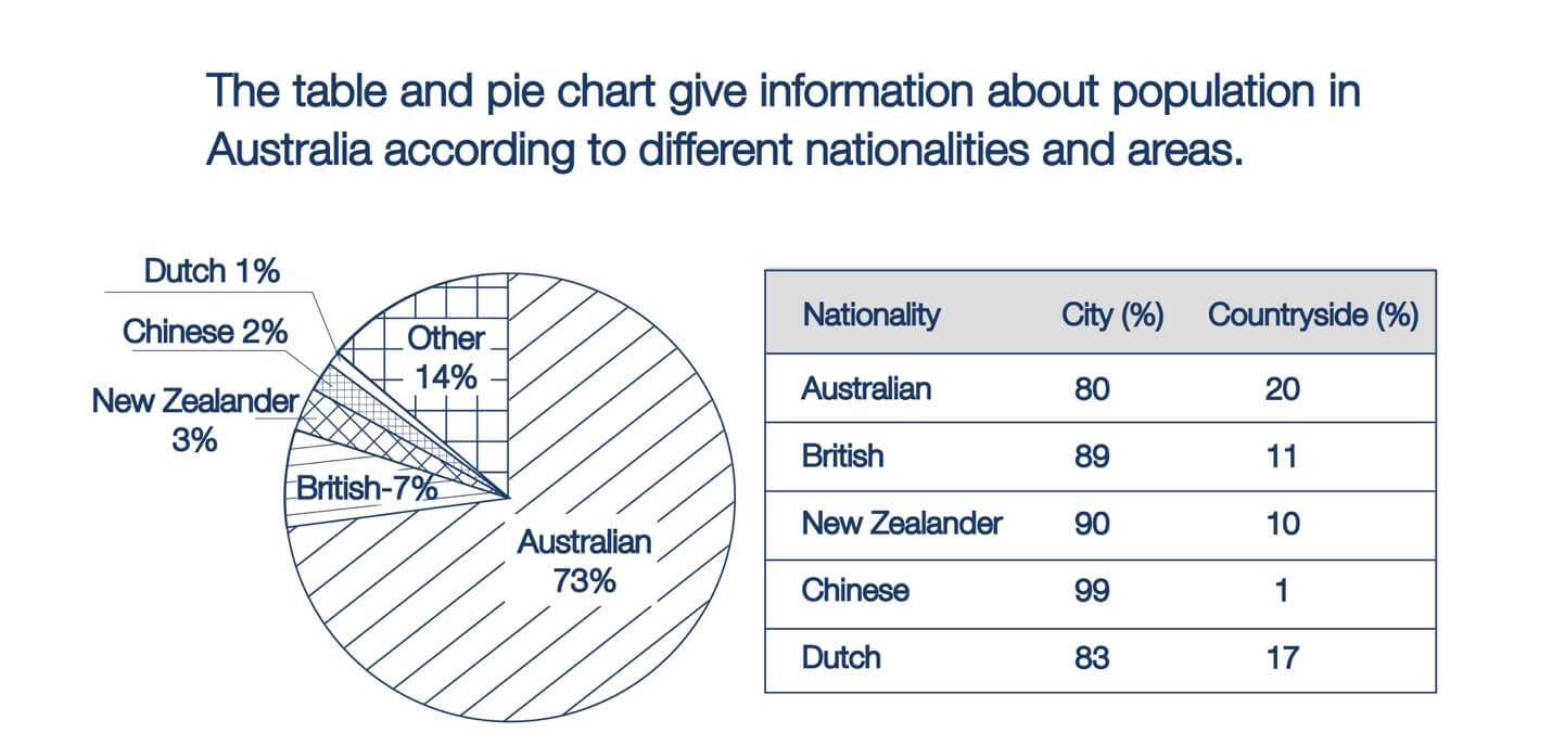
The given pie chart shows the percentage of people of different nationalities residing in Australia , while the table shows demographic figures which are classified according to urban and rural areas.
Overall, Australians are the largest nationalities, residents, almost three-quarters of the major population, and they tend to live in the urban area. This figure is followed distantly by other citizens who are almost twice the residents from Great Britain (7%), New Zealanders at 3%, Chinese at 2%, and people from the Netherlands at just 1%.
It is readily apparent that Chinese live predominantly in the cities up to 99%, whereas only 1% live in the countryside. The other vast majority of city dwellers is New Zealanders and British, which display nearly identical proportions around 90%. In terms of living areas, Australians are few likely to live outside the cities, nearly 20%, while the rest still live in urban environments. Similarly, 83% of the Dutch live in cities and 17% in the countryside.
Estimated band7.0
7.0
7.0
7.0
7.0
Response 02
146 words
The given pie chart illustrates the percentages of different nationalities that make up the Australian population, while the table gives information about whether they live in urban or rural areas.
In general, it is evident that the vast majority of Australia’s population is of Australian nationality. Furthermore, most people in this country, irrespective of their nationality, opt to live in cities.
The percentage of the Australian population that are of Australian nationality is 73%, whereas the figures for people of British or other nationalities are significantly lower, at 7% and 14% respectively. Meanwhile, 3% of the population come from New Zealand, while 2% are of Chinese nationality. 1% of Australia’s population comes from the Netherlands.
From the table it can be seen that 80% of Australians choose to reside in cities, along with 89% of the British and 90% of the New Zealanders. SImilarly, 99% of Chinese live in the city, as do 83% of the Dutch.
Estimated band7.0
7.0
7.0
7.0
7.0
Response 03
161 words
The given pie chart illustrates the percentage of people of different nationalities residing in Australia, whereas the table shows demographical figures which are classified according to urban and rural areas. The initial impression from the pie chart is that the vast majority of Australian people claim their ancestry to be of Australian origin. It is also noticeable that most Australian people, regardless of their ethnicity, are city dwellers.
According to the pie chart, Australian ethnicity makes up nearly three fourths of the total population. This is followed by the figure for people coming from the UK (7%) and New Zealand (3%). People of Chinese and Dutch ethnicity, on the other hand, made up a negligible 1-2%.
As is seen from the table, roughly 80% of people from Australia and New Zealand live in cities, whereas only around 20% lived in the countryside. A similar picture is evident in the figures for people from China and New Zealand, with their urban population amounting to a high of 90-99%.
Estimated band7.0
6.0
7.0
7.0
7.0
Response 04
150 words
The pie chart depicts the percentage of people of various nationalities living in Australia, whereas the table displays demographic data divided into urban and rural areas.
Overall, the pie chart gives the impression that the vast majority of Australians claim to have ancestors of Australian origin. It is also notable from the table that most Australians, regardless of ethnicity, are urban dwellers.
According to the pie chart, ethnicity accounts for nearly three-quarters of the total population in Australia. This is followed by figures for people from the United Kingdom (7%), and New Zealand (3%). People of Chinese and Dutch origin, on the other hand, made up a negligible 1-2% of the population.
Looking at the table, roughly 80% of Australians and New Zealanders live in cities, with only about 20% living in the countryside. A similar picture can be seen in the figures for people from China and New Zealand, where the urban population is 90-99%.
Estimated band7.0
7.0
7.0
7.0
7.0
Response 05
165 words
The pie chart depicts the constitution of those residing in Australia with respect to their nationalities, whereas the table details where these people live in an unspecified year.
Overall, what stands out from the graph is that Australian demographics hold the lion’s share in the population of this nation. Another interesting point is that most residents opt for the city regardless of ethnicity.
With regards to the pie chart, local Australian people represent nearly three fourths (73%) of the total population. Next came other countries with 14%, whilst 7% come from the UK. Those whose home countries are in Dutch, China and New Zealand hold a negligible 1-3% of total people residing in Australia.
In terms of the table, the vast majority of surveyed Australian demographics favour living in the city with 8 out of 10. A similar pattern can be seen in the figures for Dutch, British and New Zealander residents, amounting to 83%, 89% and 90% respectively. This trend is particularly evident in Chinese people with 99% choosing to live in the city.
Estimated band7.0
6.0
7.0
7.0
7.0
Response 06
160 words
The given pie chart illustrates the percentage of people of different nationalities residing in Australia, whereas the table shows demographical figures which are classified according to urban and rural areas. The initial impression from the pie chart is that the vast majority of Australian people claim their ancestry to be of Australian origin. It is also noticeable that most Australian people, regardless of their ethnicity, are city dwellers.
According to the pie chart, Australian ethnicity makes up nearly three-fourths of the total population. This is followed by the figure for people coming from the UK (7%) and New Zealand (3%). People of Chinese and Dutch ethnicity, on the other hand, make up a negligible 1-2%.
As is seen from the table, roughly 80% of people from Australia and New Zealand live in cities, whereas only around 20% live in the countryside. A similar picture is evident in the figures for people from China and New Zealand, with their urban population amounting to a high of 90-99%.
Estimated band8.0
8.0
8.0
8.0
8.0
Response 07
205 words
The pie chart and table compare various demographics in Australia by nationality and location of residence. Overall, native Australians are the most populous segment, and Dutch people account for the least. In addition, the Chinese population is most likely to inhabit cities, whereas the proportion of Australians living in rural areas is highest among all nationalities.
From the pie chart, it could be seen that native Australians account for the vast majority of the population in Australia, with 73%. Of the remaining origins , British people make up 7% of residents, which is more than twice the proportion of New Zealanders, with 3%. The percentages of Chinese and Dutch populations stand at the bottom with 2% and 1%, respectively, whereas other unspecified ethnicities altogether account for 14% of Australia’s population.
Regarding the table for demographic breakdown by location, virtually all Chinese people are urban inhabitants, with 99%. This is followed by New Zealanders, 90% of whom reside in cities, and British people, who report a level of 89%. Dutch and native Australian populations tend to be urbanites as well, though to a lesser degree. Whereas 83% of Dutch people are city-dwellers, the percentage of Australians is marginally less at 80%. One-fifth of native Australians live in the countryside, which corresponds to a quarter of their urban residents.
TA Task AchievementCC Coherence & CohesionLR Lexical ResourceGRA Grammatical Range & Accuracy
From essays on this question
Useful vocabulary
urban or rural areas
Meaning
Places in towns and cities or in the countryside.
From the essay
The given pie chart illustrates the percentages of different nationalities that make up the Australian population, while the table gives information about whether they live in urban or rural areas.
Different groups of people identified by the country they belong to.
From the essay
The given pie chart illustrates the percentages of different nationalities that make up the Australian population, while the table gives information about whether they live in urban or rural areas.