
IELTS Academic Writing Task 1Question type
Bar charts
Select and compare the most important categorical data.
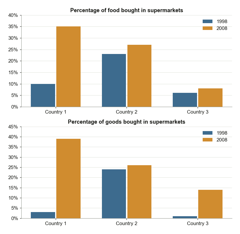
Supermarket Food and Goods Purchases in European Countries
The charts below show the percentages of food and goods bought in supermarkets in European countries in 1998 and 2008. Summarise the information by selecting and reporting the main features, and make comparisons where relevant.
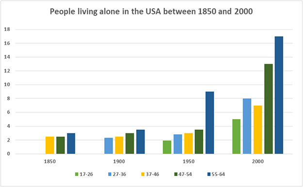
US Living Alone Percentages by Age Group
The bar chart below shows the percentage of people living alone in five different age groups in the USA between 1850 and 2000. Summarise the information by selecting and reporting the main features, and make comparisons where relevant.
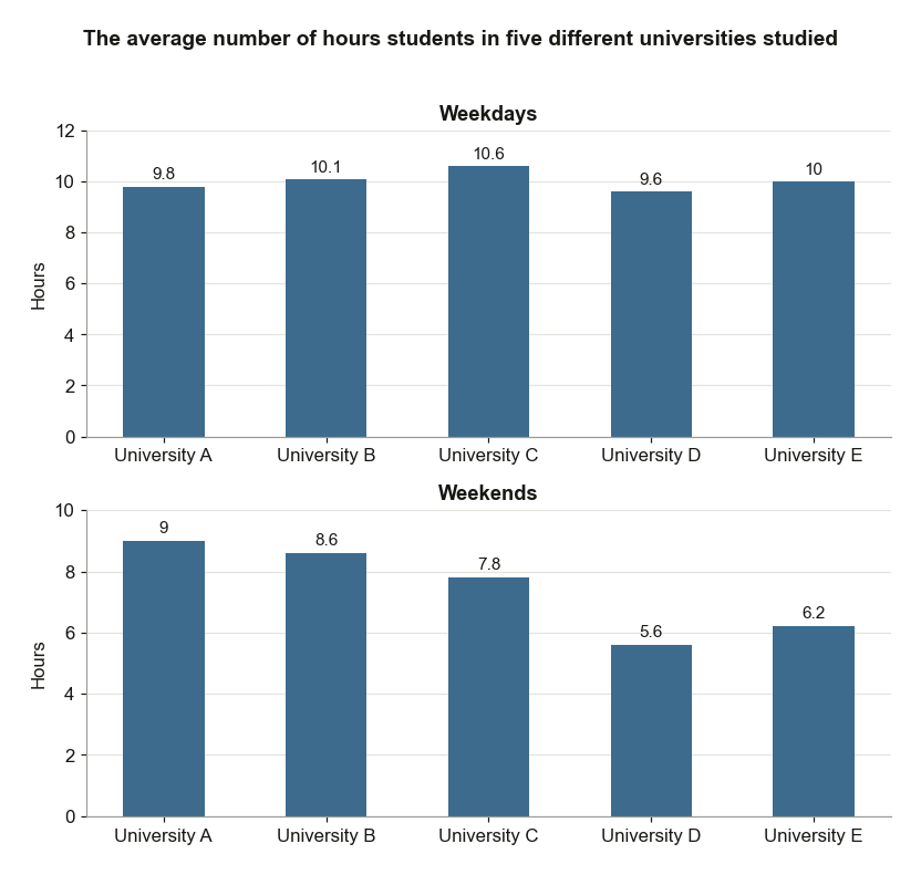
Study Hours of Students at Five Universities
The bar charts below show the average number of hours students in five different universities studied. Summarise the information by selecting and reporting the main features, and make comparisons where relevant.
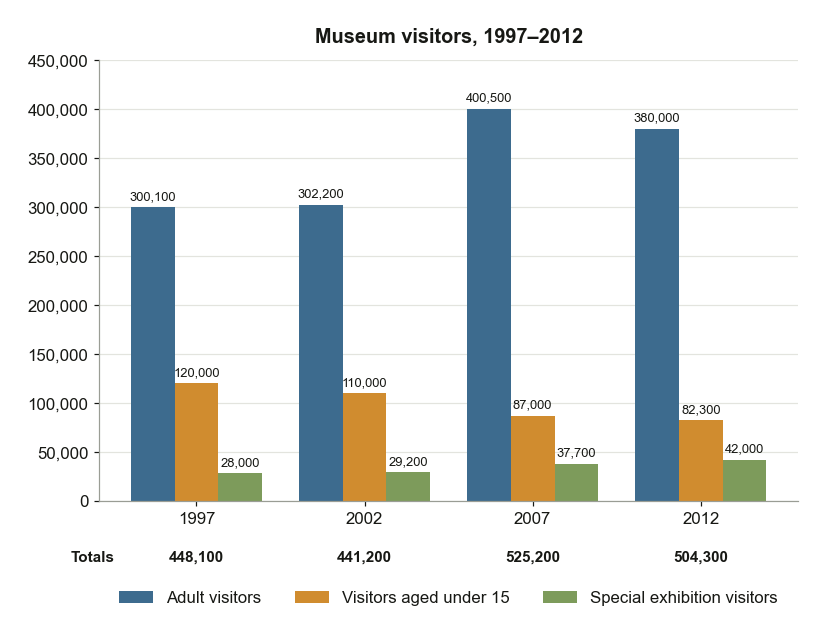
Museum Visitors by Type Between 1997 and 2012
The chart below shows the numbers of three types of visitors to a museum between 1997 and 2012. Summarise the information by selecting and reporting the main features, and make comparisons where relevant.
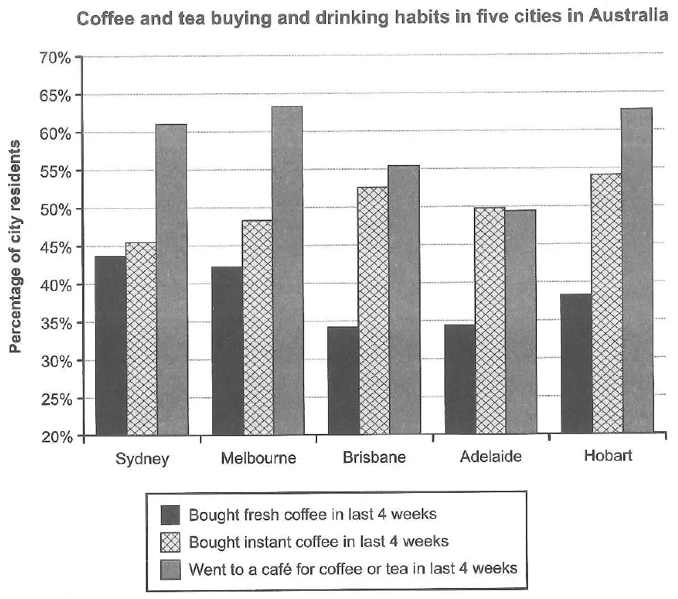
Coffee and Tea Habits in Five Australian Cities
The chart below shows the results of a survey about people’s coffee and tea buying and drinking habits in five Australian cities. Summarise the information by selecting and reporting the main features, and make comparisons where relevant.
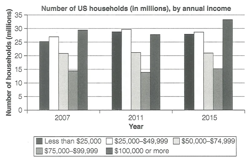
US Households by Annual Income
The chart below shows the number of households in the US by their annual income in 2007, 2011 and 2015. Summarise the information by selecting and reporting the main features, and make comparisons where relevant.
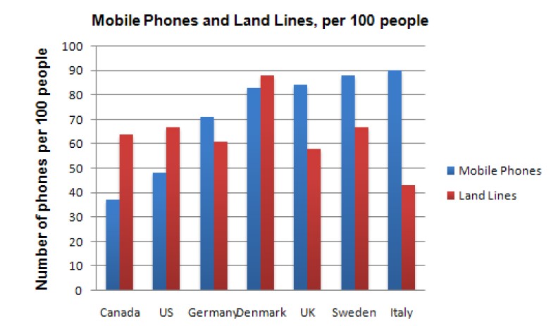
Mobile Phones and Landlines by Country
The chart shows the number of mobile phones and landlines per 100 people in selected countries.
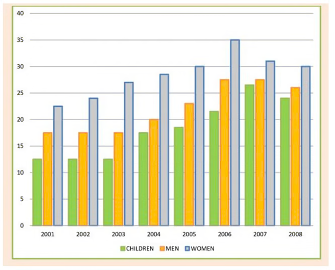
UK Daily Fruit and Vegetable Consumption 2001-2008
The chart below shows the percentage of people who ate five portions of fruits and vegetables per day in the UK from 2001 to 2008.
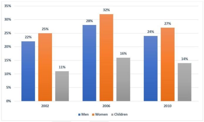
UK Fruit and Vegetable Consumption Rates
The chart below shows the percentage of the population in the UK who consumed the recommended daily amount of fruits and vegetables in 2002, 2006 and 2010.
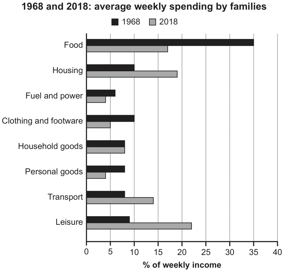
Family Weekly Spending in 1968 and 2018
The chart below gives information about how families in one country spent their weekly income in 1968 and in 2018. Summarise the information by selecting and reporting the main features, and make comparisons where relevant.