
IELTS Academic Writing Task 1Question type
Line graphs
Report significant trends and changes over time.
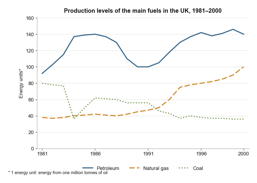
UK Fuel Production Levels Between 1981 and 2000
The graph below shows the production levels of the main kinds of fuel in the UK between 1981 and 2000. Summarise the information by selecting and reporting the main features, and make comparisons where relevant.
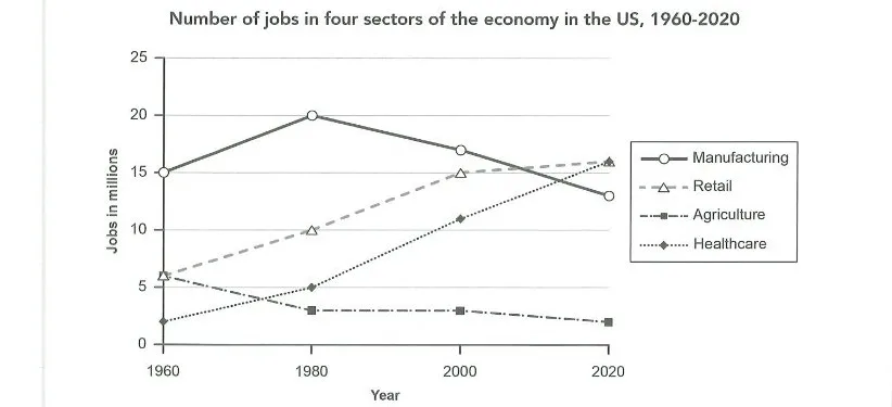
US Jobs in Four Economic Sectors 1960-2020
The graph below gives information about the number of jobs in four sectors of the economy in the US between 1960 and 2020. Summarise the information by selecting and reporting the main features, and make comparisons where relevant.
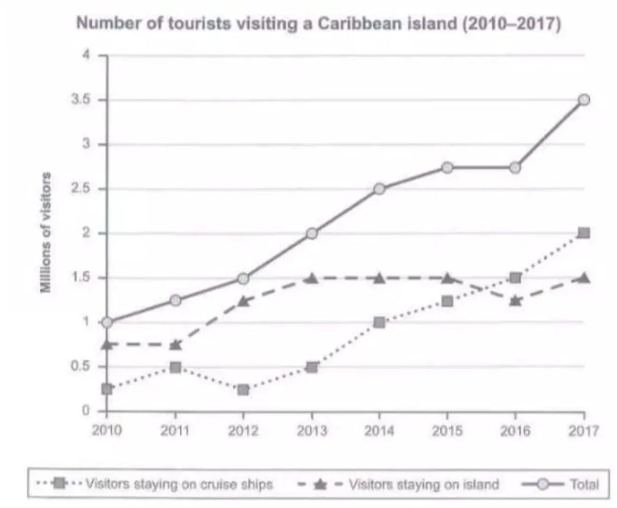
Caribbean Island Tourist Numbers (2010–2017)
The graph below shows the number of tourists visiting a particular Caribbean island between 2010 and 2017. Summarise the information by selecting and reporting the main features, and make comparisons where relevant.
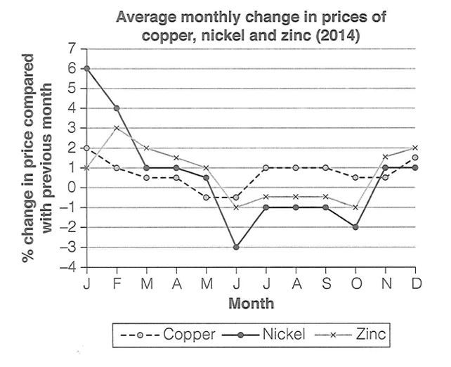
Monthly Price Changes of Three Metals in 2014
The graph below shows the average monthly change in the prices of three metals during 2014. Summarise the information by selecting and reporting the main features, and make comparisons where relevant.
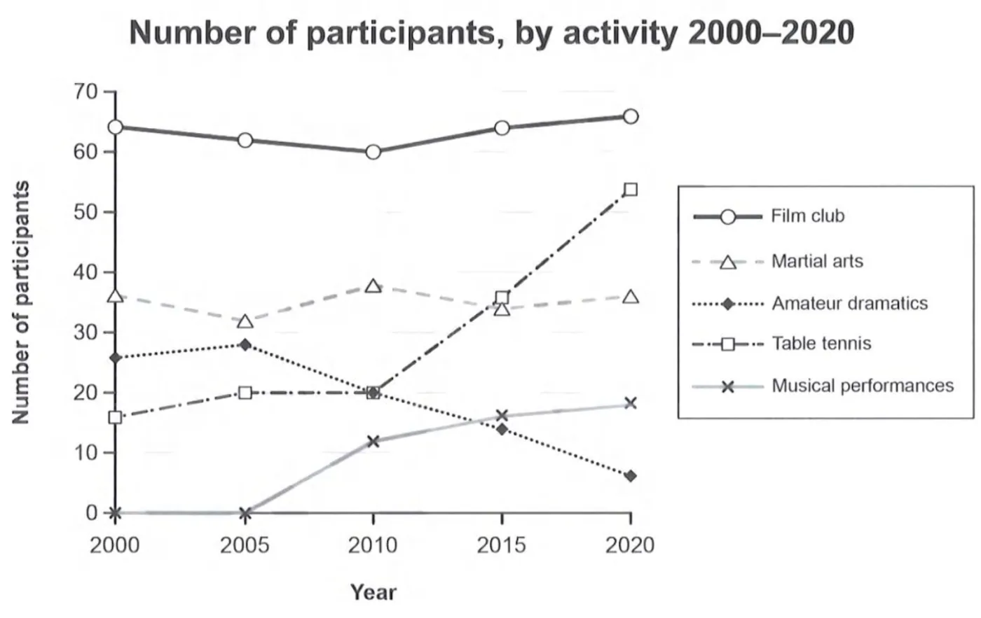
Participants in Melbourne Social Centre Activities (2000–2020)
The graph below gives information on the numbers of participants for different activities at one social centre in Melbourne, Australia for the period 2000 to 2020. Summarise the information by selecting and reporting the main features, and make comparisons where relevant.
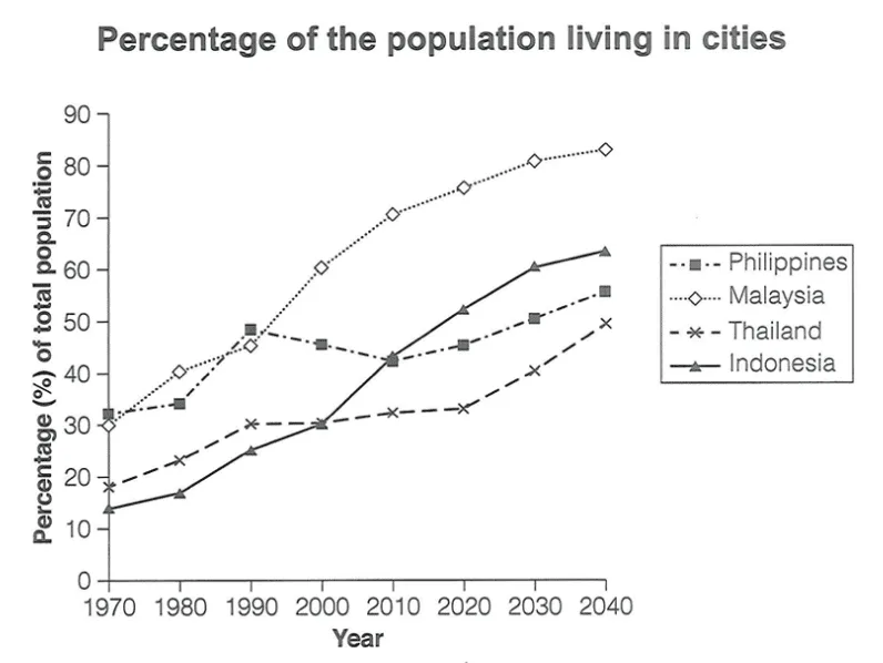
Urban Population Percentage in Four Asian Countries 1970-2040
The graph below gives information about the percentage of the population in four Asian countries living in cities from 1970 to 2020, with predictions for 2030 and 2040. Summarise the information by selecting and reporting the main features, and make comparisons where relevant.
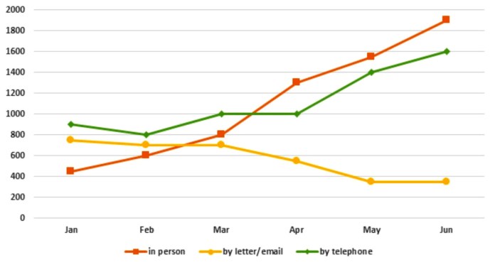
Tourist Information Office Enquiries in 2011
The graph below shows the number of enquiries received by the Tourist Information Office in one city over a six-month period in 2011.
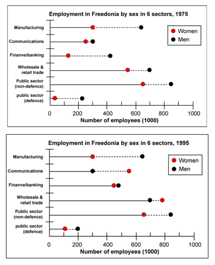
Employment by Gender in Freedonia
The graphs below show the numbers of male and female workers in 1975 and 1995 in several employment sectors of the republic of Freedonia. Write a report for a university teacher describing the information shown.
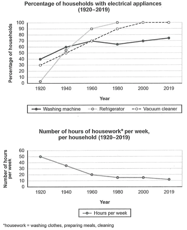
Electrical Appliance Ownership and Housework Time
The charts below show the changes in ownership of electrical appliances and amount of time spent doing housework in households in one country between 1920 and 2019. Summarise the information by selecting and reporting the main features, and make comparisons where relevant.
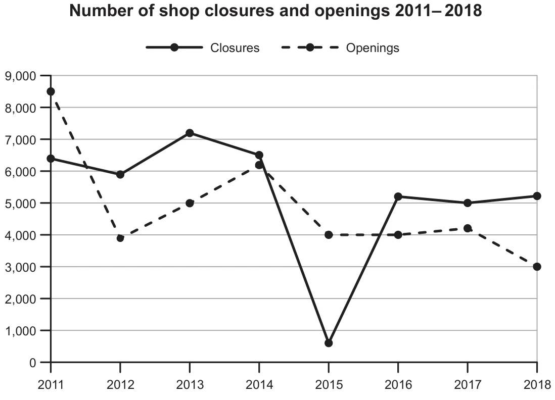
Shop Closures and Openings 2011-2018
The graph below shows the number of shops that closed and the number of new shops that opened in one country between 2011 and 2018. Summarise the information by selecting and reporting the main features, and make comparisons where relevant.