Family Weekly Spending in 1968 and 2018

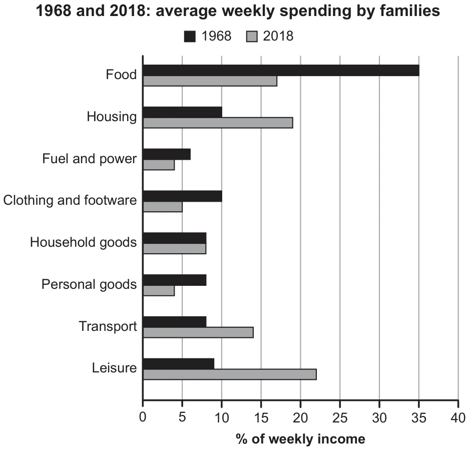
The chart below gives information about how families in one country spent their weekly income in 1968 and in 2018. Summarise the information by selecting and reporting the main features, and make comparisons where relevant.

Cambridge IELTS 17 Academic Test 3 Writing Task 1 visual

Annotated response

15 correction notes

Showing 15 correction notes.

In a Nation, several customer associations have issued, through a bar graph, some results (in percentage) of joint research on the expenditures of families in various in 1968 and 2018.

This study testified that, in the past, people were more prone to buy some items rather than others. However, this trend was set to mutate in 2018 in some cases.

The report showed that food was the in 1968, absorbing over 35% of the customers’ weekly income. No other sector could in that year. Expenditures for Housing ( 10%), fuel and power (a little above 5%), clothing and footwear (exactly 10%), household goods, personal goods, transport (all at 7%), and what consumers spent to eat.

these trends changed in some cases in 2018. from 35% in the first year to in the latter while, parallelly, the previous percentage (8%), touching barely 22% recently. People showed interest in Housing too. Money spent in this sector soared from 10% to almost 20%.

Lastly, the other goods and services had minimum variations. Families decided to invest more in transport (14% of their budget) while they did not make the same choice for and personal goods, which underwent a little decline. Households, instead, substantially flattened.

Overall assessment

Why this response received Band 6.0

The report makes several useful comparisons and recognizes the shift away from food towards housing and leisure. Its paragraph structure and varied sentence forms help communicate the broad changes. However, the overview does not clearly summarize those changes, and some figures and descriptions of their magnitude are inaccurate. The invented research background and strained vocabulary further reduce the precision expected in a factual chart summary.

IELTS criteria

How each score was decided

Task Achievement

5.5

The response compares both years and identifies the major fall in food spending and rises in housing and leisure. However, the overview is vague, the introduction invents a research source, and details such as food at "barely 15%" in 2018 and a "little decline" in clothing spending misrepresent the chart.

Coherence and Cohesion

6.0

Paragraphing gives the report a recognizable progression from the earlier year to changes in the later year. Some transitions repeat earlier points, while grouping transport under "minimum variations" weakens the logic because its share rises substantially.

Lexical Resource

5.5

The response attempts a wide range of language for expenditure and change, with useful terms such as "weekly income" and "soared". Choices such as "playful activities", "clothing and wearing" and "Households ... flattened" are imprecise or inappropriate for the categories being described.

Grammatical Range and Accuracy

6.5

A variety of sentence structures is used, including subordinate clauses and comparisons, and most sentences remain understandable. There are occasional errors in comparison structures, such as "No other sector could compare this one", alongside inconsistent capitalization and punctuation.