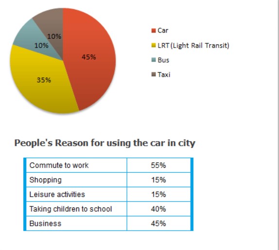
Transport and Car Use in Edmonton

The diagrams below give information on transport and car use in Edmonton.

IELTS Academic Writing Task 1 question image

Annotated response

18 correction notes

Showing 18 correction notes.

The pie chart and the information regarding the Edmonton city people use the four different types of vehicle. The data has been

Looking at the overall perspective, it is apparent that the majority of people used car for work they gave less preference to taxi as compared to

Apparently, it is that the number of people who were using by Bus and taxi which remained same. Then they gave more preference to a car. Apart from it, the proportion of those who are using the light rail transit and Bus which was more than one third and less than one-fifth the percentage of

Turning towards the remaining data, the percentage of the car was higher rather than After that 15%of people who need to use the taxi for leisure activities—furthermore, they

Overall assessment

Why this response received Band 5.0

The response attempts to cover both visuals and offers a general overview, which is its strongest aspect. However, it repeatedly misreads the data, attributing reasons for car use to the wrong transport modes, and its language contains frequent grammatical and word-choice errors that often obscure meaning.

IELTS criteria

How each score was decided

Task Achievement

5.0

The response identifies the visuals' general topics and gives an overview that car use is highest and taxi lowest, but it systematically confuses the two visuals, claiming taxi is used for shopping and LRT for taking children to school when the table describes reasons for car use, so key details are largely inaccurate.

Coherence and Cohesion

5.0

There is a visible overall structure with an overview and data sections, but progression is mechanical and coherence breaks down as misread data and awkward linkers such as 'Apparently, it is crystal noticeable' make the message hard to follow.

Lexical Resource

5.0

The response attempts some data-related phrasing such as 'more than one third' and 'one-tenth', but word choice is frequently imprecise or unnatural, including 'table chart', 'calibrated in percentile', and 'less preference to taxi as compared to other'.

Grammatical Range and Accuracy

5.0

Sentence structures show some attempts at complex forms, but frequent errors such as 'the pie chart and table chart illustrates', 'who were using by Bus', and 'they using the Light rail transit' recur across the response and often impede clarity.