
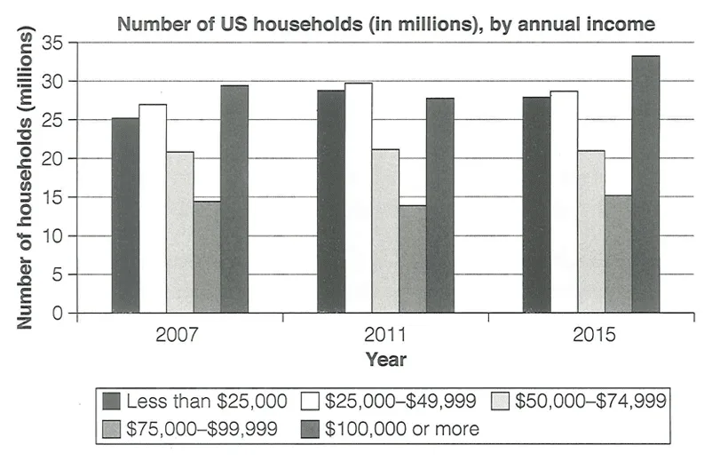
The bar chart presents data on the income distribution of US households .
Overall, the number of households earning between $50,000 and $99,999 remained relatively stable over the eight-year period, while both the lowest and highest income groups (below $49,999 and above $100,000) experienced an upward trajectory. Notably, had an income of $100,000 or more, while the $75,000 to $99,999 income group was comparatively .
The income group below $49,999 showed a minor increase in its numbers. In 2007, there were 25 million households earning less than $25,000, slightly fewer than the 27 million households earning between $25,000 and $49,999. By 2015, both categories had seen moderate growth, with approximately 28 million households falling into each group.
In contrast, the number of households within the $50,000 to $99,999 income range was lower. These figures remained consistent throughout the period, with 21 million households earning between $50,000 and $74,999, and approximately 15 million households earning between $75,000 and $99,999.
The highest income group, earning more than $100,000, experienced the most significant change. This group demonstrated an upward trend, from nearly 30 million households in 2007 to a peak of 33 million in 2015, despite a slight dip to 27 million recorded in 2011.