
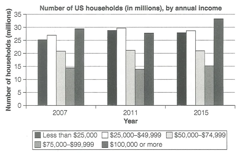
The chart provides data on the distribution of American households by their yearly income levels for the years 2007, 2011, and 2015.
Overall, most income categories experienced an upward trend throughout the period, with the exception of the $50,000–$74,999 bracket. It is also notable that households earning between $75,000 and $99,999 consistently represented the smallest group across all three years.
In 2007, the number of households earning less than $25,000 stood at around 25 million, lower than the 27 million in the $25,000–$49,999 bracket and higher than the 21 million in the $50,000–$74,999 group. By 2011, grew, with the under-$25,000 and $25,000–$49,999 groups peaking at 28 and 30 million respectively. However, by 2015, both categories to 27 and 28 million. Meanwhile, the $50,000–$74,999 bracket remained relatively stable throughout the period.
In contrast, the showed different patterns . Households earning $100,000 or more were the largest group in 2007, at approximately 29 million, while those in the $75,000–$99,999 category accounted for only 14 million. The former dropped moderately to 27 million in 2011 before rising sharply to 33 million by 2015. saw a modest decline in 2011 but recovered to reach 16 million in 2015.